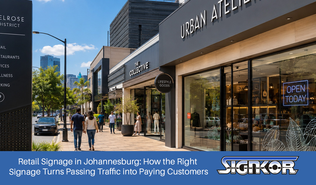
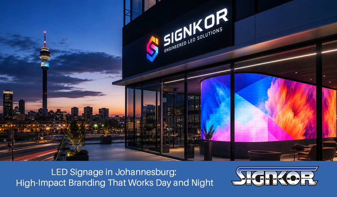
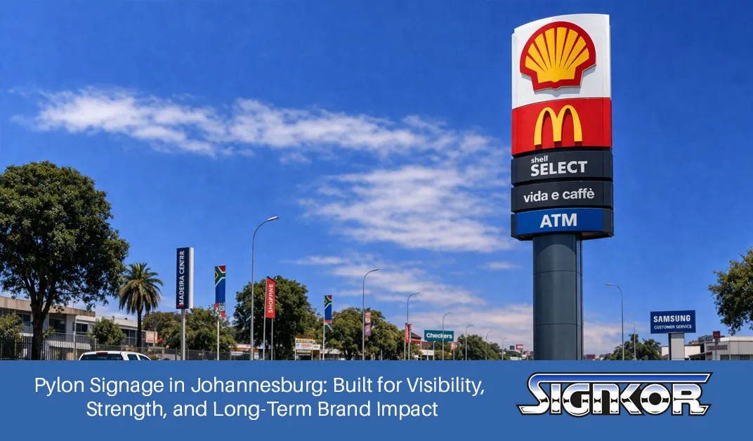
Imagine driving down a busy street, looking for a sign that tells you where to turn. Some signs pop out instantly, straightforward and easy to read, while others seem to blend into the background, only to notice once it’s too late. What makes the difference? One key factor is colour contrast—the often-overlooked hero in effective sign design.
Understanding the science behind colour contrast can dramatically enhance visibility and clarity, whether creating a storefront sign, a directional marker, or safety signage. In this guide, we’ll dive into how colour contrast works and how you can use it to make your signage more impactful, ensuring your message is seen and understood.
Why Colour Contrast Matters
Colour contrast is all about making sure that the text or graphic on your sign stands out against its background. High contrast makes a sign easy to read from a distance or at a glance, which is essential in places like busy streets, shopping centres, or public buildings. A recommended contrast ratio of 70% between text and background ensures legibility and accessibility.
For example, if your sign has a dark background, you’ll want to use light-coloured text, and if it’s a light background, darker text is the way to go. This simple rule can make a huge difference in how quickly people notice and comprehend your message.
Key Elements in Colour Contrast
- Brightness Differential: This is the key to creating high-contrast signage. By calculating the difference in reflectance between the colours you’re using, you can ensure they meet the necessary contrast ratio. Essentially, the greater the difference, the easier it will be for viewers to read the sign.
- Environmental Context: The colours that work well indoors might be less effective outdoors. The environment surrounding your sign—against a backdrop of green trees or a white building—will influence how the colours stand out. For instance, a white sign against a green landscape offers excellent visibility, while darker colours may get lost.
- Emotional and Psychological Impact: Colours do more than just contrast—they carry meaning. Red is often associated with urgency or warnings, while blue conveys calm and trust. Understanding these emotional triggers helps you design signs that not only stand out visually but also communicate the right tone and message.
Tips for Designing High-Contrast Signs
Creating high-contrast signage doesn’t have to be complicated. Here are some practical tips that can help your signs stand out:
- Opt for Bold Colour Combinations: Some tried-and-true combinations include white text on black, yellow on black, and black on yellow. These pairings are obvious and work well in various lighting conditions.
- Test for Readability: Don’t just design your sign and call it a day. Test it out! Make sure your signage is readable from multiple distances—whether someone is walking by or driving past at high speed. For roadside signs, prioritize high contrast and large fonts.
- Keep it Simple: Too many colours or overly intricate designs can dilute your message. Stick to two or three contrasting colours to ensure clarity. Less is more when it comes to delivering a clear, readable message.
- Mind the Font: Your choice of font can make or break the readability of your sign. Bold, sans-serif fonts are generally easier to read, especially at a distance. Keep font sizes large enough so that even from afar, your message is clear.
Colour Contrast in Action
Now that you understand the science behind colour contrast, it’s time to put it into action. Whether you’re designing for indoor spaces, outdoor environments, or a digital screen, the same principles apply: high contrast equals high visibility. By paying attention to brightness differentials, environmental factors, and the psychological power of colour, you can create signage that truly stands out.
At Signkor, we understand that signage is more than just a design—it’s a powerful tool for communication. Our team of experts uses the latest research in colour contrast and visual design to create signs that are not only beautiful but also incredibly effective. If you’re ready to make your signage pop, reach out to us today and let’s get started on your next standout project!